Through research I have realized all products within my advertising campaign need to relate and have a distinct connection with one another in order for the audience build recognition of the film, through the style of branding.


Through the research process I looked at specific posters and film trailers, but also whole successful film campaigns by analyzing their products and also the way in which they distribute them. Campaigns I looked at included The Blair Witch Project and Paranormal Activity. Below are some of the power point slides taken from my research. By looking at an entire campaign, (specifically including their trailer, posters, magazine covers and websites) I was able to see the connections they made through them all. I was also able to ask a sample of my audience how they thought their main product and ancillary products connected with each other and why this was effective.


I showed a sample of my audience the products within the campaign for The Blair Witch Project to enable me with feedback to see whether their opinion of the combination of products used, was the same as mine. All of the participants had an interest in the horror genre and regularly watched horror films. Shelby and Charlie had also watched the Blair Witch before.
Participants: Jordan Gale, Male, Aged 16. Charlie Sanderson, Male, Aged 17. Freya Wood, Female, Aged 18. Shelby Finch, Female, Aged 17.
Shelby: “There is an obvious like between the films website, poster and trailer. I like the colour combinations; they link well to the horror genre.”
Jordan: “I personally don’t think the quality of the products meet equal standards with other professional products that can also be seen within the industry. On the other hand however to answer your question I feel they do link well together as a whole campaign. I think the key is to stick with using the same font and colour combinations, as this is a quick way for your audience to visually relate the product within your campaign."
More was said within this focus group; however I do not think it was relevant to this question and so therefore can be seen within the evaluation question regarding audience feedback.
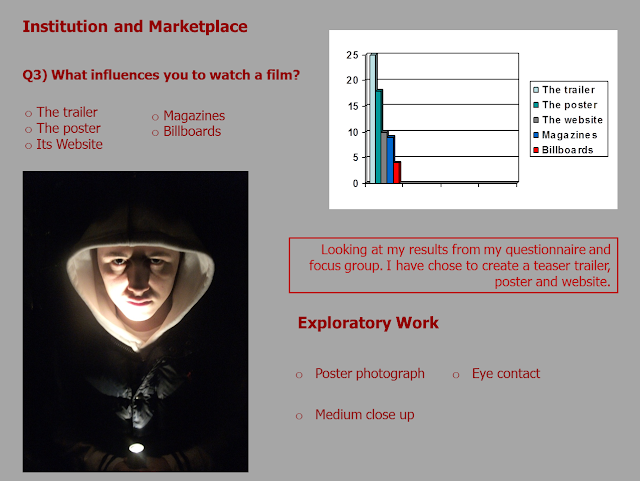
I felt for the distribution aspects of production, it was vitally important to choose the right market place to promote my film and to choose ancillary texts that would enhance the viewing of the trailer. It is significant to me, as the producer within the institution to remember the purpose of this campaign, and that is to create awareness of the film in order for the target audience to want to watch this film in the cinemas. I needed to create ancillary products that my audience would find accessible. Through research I found that the internet was the main source where my target audience, (aged between 16 and 21) mainly viewed advertising campaigns. The internet is becoming all the more popular for advertisement and so I decided a website would be the best option to include as one of my ancillary products, as it is staying level with what the professional competition is doing. In the modern society more and more people are becoming active audiences and publically convey their responses through sites like Facebook and Twitter. I will speak more about how I have responded to this in the question that explains my uses of media technology. Below is a screenshot taken from my pitch, which demonstrates how I took feedback from my questionnaires to establish what products I would be combining for my campaign.
I chose to create a teaser trailer understanding through the codes and conventions that this only has to be a short clip of events and does not have to reveal the whole narrative. I chose to do this, as I thought this technique is more enticing for the audience and is more realistically achievable at a high standard for the software I had access to.

As you can see here I asked the question, 'What influences you to watch a film?' . Another popular answer was the poster. When I researched this further people explained that seeing posters on billboards were very eye catching, especially because they are very large and high up meaning that they catch your eye, even in a busy street. I have done this through free image manipulation software, as I felt it important to show how my poster would be presented to my audience.

As you can see I have put together a visually idea of how I believe my products combine well together and each strongly contribute to the overall campaign. My idea have been contributed also from the feedback I was given and from how I have looked out other overall horror film campaigns and how I think they combine techniques well. I feel I have conveyed a repeated style throughout with the colour combinations of red, grey and black. I feel also the repeated use of blood splatter and crack throughout contributes to conveying the style of the film, which is important so the audience has a real understanding of the style and whether they would want to go and see it in cinemas or not. Every professional campaign that I have looked at involves the same typography throughout their products. I knew that it was crucial for me to do this for all of my copy in order to keep to this standard of professionalism.

No comments:
Post a Comment