Does the Product Take into Account the Boundaries of Taste and Decency
I think it is important to mention briefly within my evaluation the significance concerning the boundaries of taste and decency, especially I found within the genre of horror. Through research I was able to learn of the rules and regulations concerned within the industry examples of these include copyright and safety regulations. I was able to maintain a professional standard of reducing the risks of breaking these regulations, by creating detailed forms that covers the permissions and the risks involved within production.
I was also made aware due to safety I could not use real weapons, due to putting others at risk of harm. Instead I used fake weapons, which you could suggest was a boundary to how realistic I could make the production look. I think this was resolved within the post production stage, as I able to add effects that made this look more realistic. Not showing too much blood was something that the industry took into account and so therefore I had to in order to maintains their level of standards.
In order to account for a censorship of my film I looked at a current issue from the BBFC in detail to gather information, so that I could give my film a certificate rating that is realistic in comparison to existing professional films in the institution. This helped me to also realise what content is acceptable in the industry. I unfortunately did not put the rating of the film on any of its products. There was no particular reason why I did not do this and If I would go back to the production stage of my coursework I would do this, but now sadly I don’t have the time to make corrections. Above shows how I incorporated this into my pitch as a professional company in the industry would.
How did you use media technologies in the construction and research, planning and evaluation stages?
I feel the way in which I have blogged all of my G324 advanced portfolio coursework just conveys the way in which today’s means of advertisement has very much changed and there is an increasing amount of active audiences who use blogging and social network sites on a day to day basis. I really like the use of blogging as I feel it had many more advantages than printing the content off. I was able to be creative on my blog and demonstrate the style of my brand and horror film. I feel that I have linked the style of my blog to that of my horror teaser trailer and ancillary work. Through looking back at my AS coursework portfolio, I feel it has taken off an enormous amount of stress because at the time I had a lot of printing problems and I think this effected the quality of the final work I produced. It is also a much eco friendlier way of presenting my coursework, which can be appreciated as the environment is becoming much more of a concern within the modern society.
Through the process within my pre-production stage, I developed an intention of what I wanted to achieve from the campaign products that I created. My aim was to create and advertising campaign that enticed my target audience to want to go and watch my horror film. My goal was to do this through the use of some meaningful horror codes and conventions, but to also reject some of codes and conventions to create a unique selling point for my campaign and the entirety of my brand image for Spotlight Pictures. Therefore to achieve this, my product would have to be fit for the purpose I have mentioned. I believe audience feedback that I have taken through this evaluation, shows that I have achieved this.
Organisation was vital within the research and pre-production stage. Microsoft software helped me to be structured in this by using programmes like excel and power point. From this I was able to create detailed and accurate results from my audience feedback and present these professional within my pitch presentation via power point.
I feel that the management of production on my behalf was quite poor. On the other hand I feel my pre-production planning was very good and by planning for a contingency week helped for the production of my final campaign to be created on time and of a standard that I felt acceptable.
Within the production stage I used equipment that included a JVC HDD hard disk camcorder and also a tripod. Difficulties I found with this is that sound did not transfer well once I had imported my footage into iMovie. To overcome this I decided to mute all clips and just use sound effects.In the end I felt this actually improved my trailer, as it is only a teaser and I feel with sound effects it made the trailer more eerie and enticing. Another mistake I made was to film scenes in portrait. This meant that when it came to the post production stage and I imported the clips into iMovie certain pieces of footage were on their side and the wrong way up. This was very disappointing, as when I rotated them they automatically were cropped so that they could fit into the screen. This did not look good, or by any means professional. As a result I had to sacrifice using some of this footage, as I felt by this stage in the production it would jeopardise my final product more, if I spent more time re filming the scenes. A positive outcome from this was that within the production process, I took several takes of each scene and therefore was able to recover some footage that was not filmed in portrait. If I was able to film the production again I would defiantly take this into account, as it would have saved me time and pressure. Below is a screenshot taken from iMovie, which demonstrates visually the problems I had with cropping.
I do believe that a lot of my problems fell down to not having required software available to us when we needed it. Use of Apple Macs was very rare, as we only had a few to share with the whole class and these were needed as it contained the software iMovie, which I used to edit my teaser trailer through the post production process. This software was good to use because it was self-explanatory and therefore quite simple to use for a type of film editing software. It still did take me some time however to get used to this, however by the end I was able to use all the tools provided on there and incorporate sound text and effects into my teaser trailer. In evaluation I feel to benefit me more I could have experimented with using the software in earlier stages of the coursework so that when it came down to the post production stage I would have been more confident with using the software and therefore could have produced a final product that had a higher input of skills.
I also faced problems with sound levels within my production. As I have already mentioned key codes conventions I found connected with the horror genre was silence followed by sudden, jumpy sounds. It was hard to define the difference between jumpy and loud, because I realised through the process they do not mean the same thing!As I sourced my sounds from different locations, they all played at different level. Although it was very time consuming, I was able to resolve this within iMovie as you could quite simply adjust the levels. Below is a screenshot showing how I corrected this.
As I have mentioned I used the website design software, moonfruit. I have spoken through the process how this was very useful to use as it was free to users and use were able to use a various amount of tools within the programme. One difficulty I should mention that I had within this programme is the limitations I had with importing images into the different pages. I was hoping to import a wide range of images that I had taken within my website, however it told me that I had exceeded my quota, meaning that there were data capacity restrictions that I had because I was only using their free service. Although I was not able to incorporate all of my images, I feel the final outcome was still adequate, because I was able to reduce the amount of images I used to those of the best quality.
Through the whole journey of this coursework I have experienced technical problems that I feel I planned time for and therefore was easily able to overcome them. One of these was security problems with trying to upload my teaser trailer onto YouTube within college.This took up some unnecessary time at the end of my production process, but was easily resolved by changing my exporting methods. I am glad I was able to put my teaser trailer on YouTube, as it is a worldwide used site. Figures show that there are over 750 million users registered to YouTube. This may not be a realistic figure, because people may have multiple accounts and new people sign up every day however the large units demonstrate how popular the site is. It is a great way to be able to distribute my teaser trailer, as this is where professional institutions also distribute.
As you can see form the screenshot above I have also created a twitter account as like YouTube this is a very worldwide, popular social networking site. It was important to me to use a range of media technologies throughout and specifically through the distributing process, as I have found that a combination of several give a bigger impact to your campaign and helps with audience feedback.
What have you learned from your audience feedback?
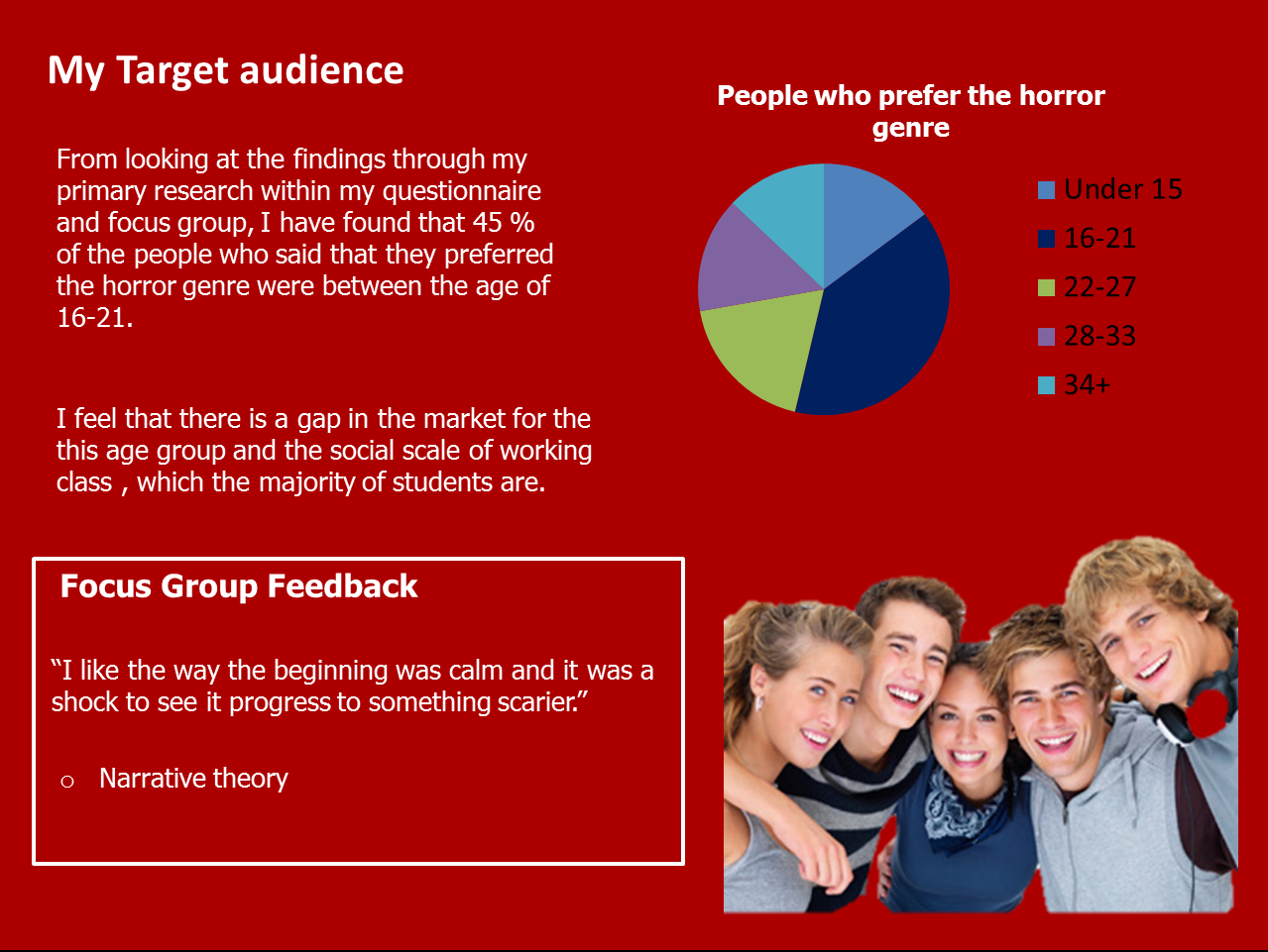
Through the research process I devised an audience profile that gathered information of my target audience. This audience was chosen because they gave a great interest in the horror genre and felt that there was a gap in the market for a film of this genre.
Ancillary product through early post production (not final product)
My audience feedback has been very helpful, especially as it is vital that they have a liking of my products, as they are who I am inevitably creating the campaign for. I think my strength in gaining feedback through different stages of the production helped me to stay focused and on track to what my audience needs and likes were. An example of when audience feedback vitally helped was to establish my narrative. When I showed people my website, poster designs and filming through an earlier stage of products a concern was raised that it was hard for the audience to have a great understanding of the narrative and were slightly confused how the main product connected with my ancillary work. I immediately adjusted the narrative slightly and I feel that now my campaign conveys a strong demonstration of the horror genre and the narrative within this. It was very positive to get this feedback, as from the mistakes I made through the process and the decisions I made regarding the feedback I got I was able to better my work and higher my standards to that of a more professional level.
Screenshot from footage that was incorporated into my trailer
To keep to the level of professional standards within the industry, I created a pitch that demonstrated my ideas through the use of feedback taken from my audience. Below is a slide taken from my pitch presentation, which justifies my reasoning for choosing the specific target audience through the use of qualitative and quantitative research. Some focus group feedback has been incorporated into my pitch, however I did take out more intensive and detailed audience feedback through the research and planning stage of production. This enabled me to solely see what my audience liked within the horror genre. By doing this at an early stage I reduced the risk of creating products that my audience didn't approve of at a later stage of production.
I feel that the final typography design I have created for my products has been one of my main strengths through the production stage and is what has made my final trailer and ancillary work look of a more professional standard. This is due to me taking the time to ask samples of my target audience their critical opinions towards my ideas. They were very co-operative in giving me advice within this area and as you can see my final typography has turned out far different from my initial idea that I had in the research stage. I believe my final production if far better from my original ideas as they feedback below shows that the people from my previous focus group much prefer the final outcome, than the previous initial ideas. In evaluation I believe the most important factor towards making a 'successful' media product is to have the approval of your target audience, as they are the people you are investing in to buy, like and use your products.
Focus Group - 29/03/2012 (10.20am - 10.45am)
Jack Wallace Age 18- Daniel Kimmitt Age 15- Mollie Ely Age 18- Shelby Finch Age 17- Chloe Tomlinson Age 18
Below is the transcript taken from this focus group. I think it is important to mention that I performed this focus group with the same people as a previous focus group I had taken out. I done this because I was very interested to know what they thought of the final outcome and whether they liked the changes that I had made, as they are the people that effectively advised me on what changes to make. One of these participants were unfortunately unable to return to this second focus group, however I assigned someone knew as I thought it would also be a good idea for some fresh eyes to see my work and also here their opinion. I started by showing the group my entire campaign, including the main product (teaser trailer) and both ancillary products (The film release poster and film website). I specifically asked questions close to the brief of the evaluation, in order to help me honestly evaluate my work. I asked them to answer honestly and in detail.
Interviewer (me): How well do you feel my final products convey the codes and conventions of the horror genre?
Shelby: Can I start by saying I think you have done exceptionally well. There are so many things in your products that shout out horror to me! One I would defiantly like to mention is your style of text with the blood splattered backgrounds. These are exactly things you would see in horror movies and I should know, as I watch so many of them!
Jack: I totally agree with you Shelby! The jumpy sound effects in the trailer and the use of costume and make up design all are great horror techniques that you have used. I think you have found a nice balance between including some obvious horror techniques and then applying some of you own new and original stuff to make it your own and not look tacky or far-fetched!
(Jacks comments here have demonstrated in other people’s opinion that I have achieved my goal incorporate but also challenge codes and conventions. Without this type of feedback I would never be able to measure how effect my campaign is.)
Interviewer (me): How do you feel my main product and ancillary products compare to professional existing products.
Mollie: As Shelby has already mentioned the use of typography was so great, it really does look to a professional standard. It’s great how you have played on this strength and used it several times throughout your products. Repetition is good in this case.
(This feedback has helped me to realise how the software pixlr has really helped me to keep a high standard of quality and without this use of media technology I would of never of been getting such positive feedback from my target audience.)
Daniel: I agree with Mollie and in addition think your use of sound effects really reminds me of what you would here from professional horror films and so therefore you’re using the techniques for me to actually feel scared when I watch your trailer. One minor negative I would add to this is that I think although your website is very good, in my opinion it’s not of the same level of quality as your trailer and poster. It does still use the conventions of the horror genre, so I don’t think you should worry too much!
(This comment justifies my reasoning for not really liking moonfruit as a web design programme. If i was able to do the production stage again I would maybe use different software, as I felt this gave me many restrictions and now my feedback supports this.)
Interviewer (me): How well do you feel my entire products combine together to create a campaign which demonstrates a consistent style and brand image.
Shelby: I have to admit a few months ago when you explained the narrative of your film to us I was slightly confused and thought it may have been a bit complex. Now you have made some positive changes I feel that all your products combine well together, espicially the poster and trailer. The use of crack and blood splatter on both shows real consistency, along with the colour theme and same font throughout.
Chloe: It’s great you have the little corpse girl shown on every one of your products. This shows a strong connection between all of your products and if I so that little girls evil expression up on a billboard somewhere I would know it was part of your product! You have really developed a brand image for your film, you should be very pleased.
Interviewer (me): Do you have any other general comments about my campaign that have not already been mentioned, either positive or negative?
Mollie: No one has really mentioned the camera techniques you have use. As I have previously taken A level media before, I know how important this can be to demonstrate professionalism and also the genre, I think your shaky cam technique conveys the horror genre nicely and also does the use of close ups. I know you said you were taking inspiration from films like The Blair Witch and Paranormal activity. I can really relate your work to these.
(This comment shows how I have taken ideas through from my pitch to my production, although I have developed my ideas, I have kept the same concept, which I think is good because I have been able to better this other time.)
Interviewer (me): Thank you so much for your great feedback guys, you have been such a help to me and I appreciate having your time to do this.
Below is a video taken from this focus group which demonstrates Daniel Kimmitt watching my teaser trailer on You Tube and then his response given to it. It shows positive feedback of how a member of my target audience liked the trailer. It is reassuring to know that someone who loves horror films would be interested to go and see my film after watching the trailer. It shows that I have followed the codes and conventions from existing professional works to be compared to the same level of standards as them.
How effective is the combination of your main product and ancillary texts?
Through research I have realized all products within my advertising campaign need to relate and have a distinct connection with one another in order for the audience build recognition of the film, through the style of branding.
Through the research process I looked at specific posters and film trailers, but also whole successful film campaigns by analyzing their products and also the way in which they distribute them. Campaigns I looked at included The Blair Witch Project and Paranormal Activity. Below are some of the power point slides taken from my research. By looking at an entire campaign, (specifically including their trailer, posters, magazine covers and websites) I was able to see the connections they made through them all. I was also able to ask a sample of my audience how they thought their main product and ancillary products connected with each other and why this was effective.
I showed a sample of my audience the products within the campaign for The Blair Witch Project to enable me with feedback to see whether their opinion of the combination of products used, was the same as mine. All of the participants had an interest in the horror genre and regularly watched horror films. Shelby and Charlie had also watched the Blair Witch before.
Shelby: “There is an obvious like between the films website, poster and trailer. I like the colour combinations; they link well to the horror genre.”
Jordan: “I personally don’t think the quality of the products meet equal standards with other professional products that can also be seen within the industry. On the other hand however to answer your question I feel they do link well together as a whole campaign. I think the key is to stick with using the same font and colour combinations, as this is a quick way for your audience to visually relate the product within your campaign."
More was said within this focus group; however I do not think it was relevant to this question and so therefore can be seen within the evaluation question regarding audience feedback.
I felt for the distribution aspects of production, it was vitally important to choose the right market place to promote my film and to choose ancillary texts that would enhance the viewing of the trailer. It is significant to me, as the producer within the institution to remember the purpose of this campaign, and that is to create awareness of the film in order for the target audience to want to watch this film in the cinemas. I needed to create ancillary products that my audience would find accessible. Through research I found that the internet was the main source where my target audience, (aged between 16 and 21) mainly viewed advertising campaigns. The internet is becoming all the more popular for advertisement and so I decided a website would be the best option to include as one of my ancillary products, as it is staying level with what the professional competition is doing. In the modern society more and more people are becoming active audiences and publically convey their responses through sites like Facebook and Twitter. I will speak more about how I have responded to this in the question that explains my uses of media technology. Below is a screenshot taken from my pitch, which demonstrates how I took feedback from my questionnaires to establish what products I would be combining for my campaign.
I chose to create a teaser trailer understanding through the codes and conventions that this only has to be a short clip of events and does not have to reveal the whole narrative. I chose to do this, as I thought this technique is more enticing for the audience and is more realistically achievable at a high standard for the software I had access to.
As you can see here I asked the question, 'What influences you to watch a film?' . Another popular answer was the poster. When I researched this further people explained that seeing posters on billboards were very eye catching, especially because they are very large and high up meaning that they catch your eye, even in a busy street. I have done this through free image manipulation software, as I felt it important to show how my poster would be presented to my audience.
As you can see I have put together a visually idea of how I believe my products combine well together and each strongly contribute to the overall campaign. My idea have been contributed also from the feedback I was given and from how I have looked out other overall horror film campaigns and how I think they combine techniques well. I feel I have conveyed a repeated style throughout with the colour combinations of red, grey and black. I feel also the repeated use of blood splatter and crack throughout contributes to conveying the style of the film, which is important so the audience has a real understanding of the style and whether they would want to go and see it in cinemas or not. Every professional campaign that I have looked at involves the same typography throughout their products. I knew that it was crucial for me to do this for all of my copy in order to keep to this standard of professionalism.
In what ways does your media product use, develop or challenge forms and conventions of real media products?
Blair Witch - Screen shot
The research and planning section of this coursework was very important in helping me to establish the formatting of a ‘good’ campaign that uses the codes and conventions of the horror genre. Looking at existing professional products, has defined to me the industries standards of products and what my own creations will be compared against. From this research I have found horror productions frequently use colour themes of grey, red and black. Close up and extreme close up shots so as an audience we do not get to see the full picture to create suspence. Silence and sudden contrasting use of loud, jumpy sounds. Through applying some of these typical horror codes and conventions, I feel that I have been successful in creating a new and original artifact that fits in with the type of products that are currently being sold. Professional products that I have looked at through the research and planning process included The Blair Witch Project and Eden Lake. From these I took inspiration for both narrative and setting. I especially I looked at Blair Witch and Paranormal activity for camera techniques and effects. Through research I have found that both of these films were very known and successful, due to using these techniques. For this reason I chose to use their techniques as significant inspiration, as I felt they were reliable sources and were texts that continuously were mentions by my target audience, through my initial questionnaire and focus group.
Tha Dare Devil (my own production) - Screen shot
I feel I have used the forms and conventions successfully within my teaser trailer and also my poster and website design for the film. My own opinion of this can be backed up by the opinion of my audience, as I asked a sample of target audience through a focus group, what they thought of my teaser trailer and ancillary work.
Jack Wallace, Male, Aged 18
Audience Feedback
I asked my focus group what they thought of my main product and ancillary products in conjunction with the horror genre, comparing them to professional works. I gave them time to look at all the products, as they would if they had an interest in watch the film. Below are some quotes taken from an answer form Jack Wallace. I feel his response evidentially helps the response of my answer to this evaluation question.
"When I think of horror, I instantly think of the colours red and black. The red reminds me of blood and you have used this throughout all of your products.... ..Sound affects you have used can also be seen in other horror films that I have watched. These are very effective, as they get your heart racing!.... The close up shots you have used in the trailer add great effect and also make you jump out your skin, as they are unexpected at times and using the eyes in the poster reminds me of the devil and shows real evil emotion.... In summary I can see you have looked at professional horror films and taken inspiration from these. You have done well, as it’s made me want to watch the film!
I feel that I have followed the rules and used the content and style professionally used within the industry that is needed to produce a successful product that has a place in the market. Throughout the post production process I have been able to edit by products in different manipulation software for example in iMovie.
Above is a screenshot that shows how I have incorporated different effects into the mise en scene of both the moving and still images within my teaser trailer. Effects that I chose to use were types like 'bleach bypass', 'sci fi', 'x ray' and 'day into night'. Similar effects are used within professional horror products, including the famous texts I have already mentioned. I have learnt from my research that these effects enhance the horror theme and can make an image look a lot more terrifying. I feel that by using this software I have been able to apply these effects that are associated by the audience with the horror genre and therefore I have been able to entice my audience through my advertisement campaign to want to watch the film. This is the main objective of the campaign and therefore I feel I have succeeded with that.
Sound has also had a substantial influence within conveying the codes and conventions within my horror teaser trailer. I feel I have very much used popular horror sound effects, for example 'boom' sounds and ' screams', as again the audience can relate to this and it enhances the scary atmosphere that I have displayed within the narrative. The screenshot above shows visually how I have applied this through the use of iMovie. I had learnt from existing professional trailer that a good effect was to build tension within the trailer, and while doing this you create enigmas for the audience. To build up this tension I increased the volume of certain repeated sound effects gradually throughout the trailer. The scream effect I used was also enhanced to get an instant scare from the audience. This seemed to be effective when a sample of my target audience watched the trailer for the first time.
As I have mentioned I think that I have followed the rules that a professional production company or publishing house would have to follow. I feel that I have kept within the laws of publishing, decency and copyright. Through this coursework task I have learnt that to abide by these laws within the media, you have to go through a very long and detailed process. Planning and organisational skills were vital at this stage in the pre-production process, and I feel that I dealt with this well. All content within my products are my own, with the exception of some of the sound effects, which were publically available for all within iMovie. I had permission of all my actors to be featured in my products and also location permission for where I was filming. Detailed safety precautions were also taken and evidenced through forms, which can be found within the blog headed under the title 'Pre-Production Forms'.
I chose to create a teaser trailer and also a film website and film release poster to support my film advertisement campaign. I chose to use these mediums, as through research of distribution campaigns, I have seen within the horror genre that these products are repeatedly used to entice and sell the product to its audience successfully.
Through my research and planning I looked at various different styles of products for horror film campaigns made by professional institutions. From this I was able to define the codes and conventions for the different individual products. Looking at my ancillary work, I can say that I have used some of the codes and conventions, and also challenged certain ones so that my products were original and unique to my style to convey individuality of my brand to the audience and a unique selling point. Specifically looking at poster designs I identified effective use of composition, image effects, typography and colour. To the left is a professional published artefact that has influenced me, as being a member of its target audience it has used the codes and conventions that has sold the campaign to me successfully, as it has targeting my needs and expectations. I have tried to demonstrate this within my own posters to target a very specific audience.
Above is one of the posters I made. Firstly I decided to make more than one poster, as through my research of film campaigns in the institution I have found that companies use more than one poster to sell their film and these are normally very contrasting, but demonstrate the same information. I have included a masthead, tagline/slogan and other copy including the release date and actors. I have included images and also sponsors at the bottom. I have decided to incorporate all of these things, because I feel it demonstrates professionalism and my audience can relate to layout as this is what a professional industry would repeatedly include. A film poster has to be clear and eye catching, as your audience may only see a short glimpse of it, especially if it was situated on a billboard in a busy street and you were passing in a car. I feel that everything is strongly imported into my poster and therefore is eye catching to my target audience. I feel the use of blood splatters and the colour of red to symbolise blood strongly demonstrates the rules and ingredients needed to convey the horror genre. My second advertisement demonstrates a teaser poster. Here I have tried to focus on my strengths of production, which through feedback I believe to be typography design.
This one was very much more preferred as a horror poster by my audience. They said it demonstrates a more confident knowledge of the codes and conventions of horror, whereas with my previous poster they were confused of the genre as they thought it could be promoting the crime genre.
I created this typography, by firstly downloading an eroded style font from the internet called 'MASTERPLAN' I then installed this into image minipulation software called Macromedia Fireworks. There I began by adding a bolded effect and a sharpening filter, which gave the font better definition. I then added a white glow and drop shadow effect, so that it would still stand out on a dark backgorund. This is what the finished typography looks like shown above and evidence below of how I created this.
As you can see I have added a dark eroded background to the typography. I thought this suited well, as I think that it links nicely to the style of the text and also the codes and conventions of the horror genre.
I developed the image effects further in an image manipulation software called PIXLR. Within this software I was able to add different styles of brush marks layered over the page. These included crack marks and blood splats. To add to the codes and conventions further I decided to use these in the colour dark red, because this demonstrates the effect of blood.
Evaulating through Produciton
I decided to ask small samples of my target audience, throughout the different stages of production, whether they liked the products I was working on and their reaction to them in relation to the horror genre.
I asked my focus group, "Do you prefer the plain text images, or the one with additional horror related effects for example cracks and blood splatter?"
Shelby, Female, Aged 17: "Defiantly the one with blood splats. Instantly reminds me of the horror genre."
Noella Amos, Female, Aged 19: "Wow the the cracks and blood splats look really effective and professional."
Jack Wallace, Male, Aged 18: "I personally prefer the red effects over the text. It looks really realistic and suits for the horror genre."
From this feedback I have chose to use the typography with cracks and blood splatters. As the feedback was so positive I have decided to also use these effects of other of my media products including the poster.
Poster Design
Blow is a first mock up of my poster design, created from inspiration of professional works in the institution.
I started by editing the original image in a image manipulation software called PIXLR. Here i adjusted the hue and saturation. I then imported the image into Microsoft Fireworks, where I cropped out the background by using the polygon lasso tool. I made the edge of this 'anti alas', as you can see evident from the screenshot above. This mean that the edges would be be to sharp and there gave a more realistic and professional finish.
Next I imported this into a new black canvas. There I positioned it to the bottom left hand corner and then went on to add the typography I had previously designed, however this time with a red glow effect added around the text. I chose to use the colour red, as it follows the codes and conventions of the horror genre and therefore my target audience can relate to this. I also layered an image of the cottage behind, which I cropped using a feather edge to give the effect that there is a glow or mist behind it.
Above shows the work in progress for what could be my final release poster. I added the brush effect I have used previously in PIXLR. I have also added a slogan, 'I dare you to run.' The poster still needs work, especially with the composition of the text. To develop this I have like to experiment with the positioning of the copy within the poster and also add more copy with more detailed information in regards to the film.
I added to this trailer poster, as you can see above. I added conventions that professional institutions use within the poster design industry, specifically through the genre of horror. Im not sure whether image of the boy in a hoody on the poster is the strongest way to demonstrate the narrative and genre, because it could be percieved to be a representation of the gangster genre.
Here is another poster that I am in the process of developing. I created this within the image manipulation software Macromedia Fireworks. I started by using the photograph I have taken of the cottage within my film as a backdrop for this poster. I then cropped another image I took of the corpse girl within my film. I used a feather edge when cutting out near her hair to give a more realistic effect. Next I added the effect of red pupils by using the pencil tool and then layer this image over the one of the cottage. I then added the typography I have previously created to create the existing image shown above. To develop this I would like to add extra copy regarding information of the film and also some blood splatters and cracks to emphasis the horror genre through the use of codes and conventions.
Before developing the style of the poster above any further, I decided to ask a sample of my target audience what their views were on it. To my surprise although they knew it was a work in progress, they still really disliked the poster, saying that they felt it had little correspondence to the narrative of the film and the codes and conventions of the horror genre. It was then it came to my attention that I was maybe not quite following the wants and needs of my audience. This is when I looked back at my research and decided to focus on my strengths, which in my audiences’ opinion was my use of typography design. Below is the work in progress for which I feel will be the final teaser poster for my campaign.
I created this entire poster using PIXLR. This is free software available to anyone online. This allows you to use a number of amazing tools very much the same as Photoshop. I feel that not having access to Photoshop within this coursework has not limited me within the production process, as I have been able to create all of my ideas within PIXLR. I started with the first layer using shades of black white and grey. I was able to use a brush tool that enabled me to insert cracks on the page. Other the top of this I layered again more cracks and blood splatter effects, this time in the colour red to convey the codes and conventions of blood and death with the link to the horror genre. Next I added an existing image I had taken and cropped this to just show the eyes. I added red pupils as this is a code and convention frequently used to represent the devil. I faded this into the background, which I think blends the whole image together nicely. Finally I added copy, which I had already designed the typography for and spoke about previously within my blog. To finish this I need to add sponsors and my company logo at the bottom. I also want to add my slogan, which is 'I Dare You to Run'.
Above is the completed poster for my horror campaign, which has been screenshot within pixlr, as evidence of how I created the product. To finalise the work I adjusted the contrast and brightness to give more of a crisp finish, which enhanced the colours and made the poster more eye catching.
Here is my own website created with the purpose of publishing information about Spotlight production company and specifically 'The Dare Devil', which is the film I am creating a marketing campaign for.
As i have already mentioned I have used the website design software called moon fruit. I have also used sources from widget library, Google and Macromedia fireworks to combine creativeness into the website through the use of effects and transactions on images for example photo streams and banners.
I have decided to incorporate other companies advertisements in my website, as I know that professional websites do this also through the use of banners as sponsors.
I have tried to display the codes and conventions of the horror genre through the website, and maintain the same style through the whole marketing campaign to show consistency and develop a brand identity.
Below is a screenshot to show how i have been able to link certain things on the page to other pages on the website. I have also linked parts to YouTube. I think navigation is important to demonstrate within my website, as it shows a level of professionalism that other professional institutions use.
Below is a screenshot that I have taken that demonstrates how I have inserted images into my website. The limitations with this is that because I chose the free option on moon fruit, I only had a certain amount of data usage so I wasn’t able to upload all the images that I wanted to. Down the left hand side of this image you can see that there were a lot of tools I could use and the widget library was particularly useful. I inserted a lot of widget examples include an animated countdown timer and also scrolling text.